
There are roughly 1,600 regulatory air pollution monitors across the United States. A country of 330 million people, 3,000 counties, and 84,000 census tracts — measured by 1,600 sensors.
Most counties have exactly one.
That sparsity alone would be a problem. But the research by Haskell-Craig and colleagues asks a more uncomfortable question: when there's only one monitor per county, where does it end up? And who gets left out?
The finding that holds across every region
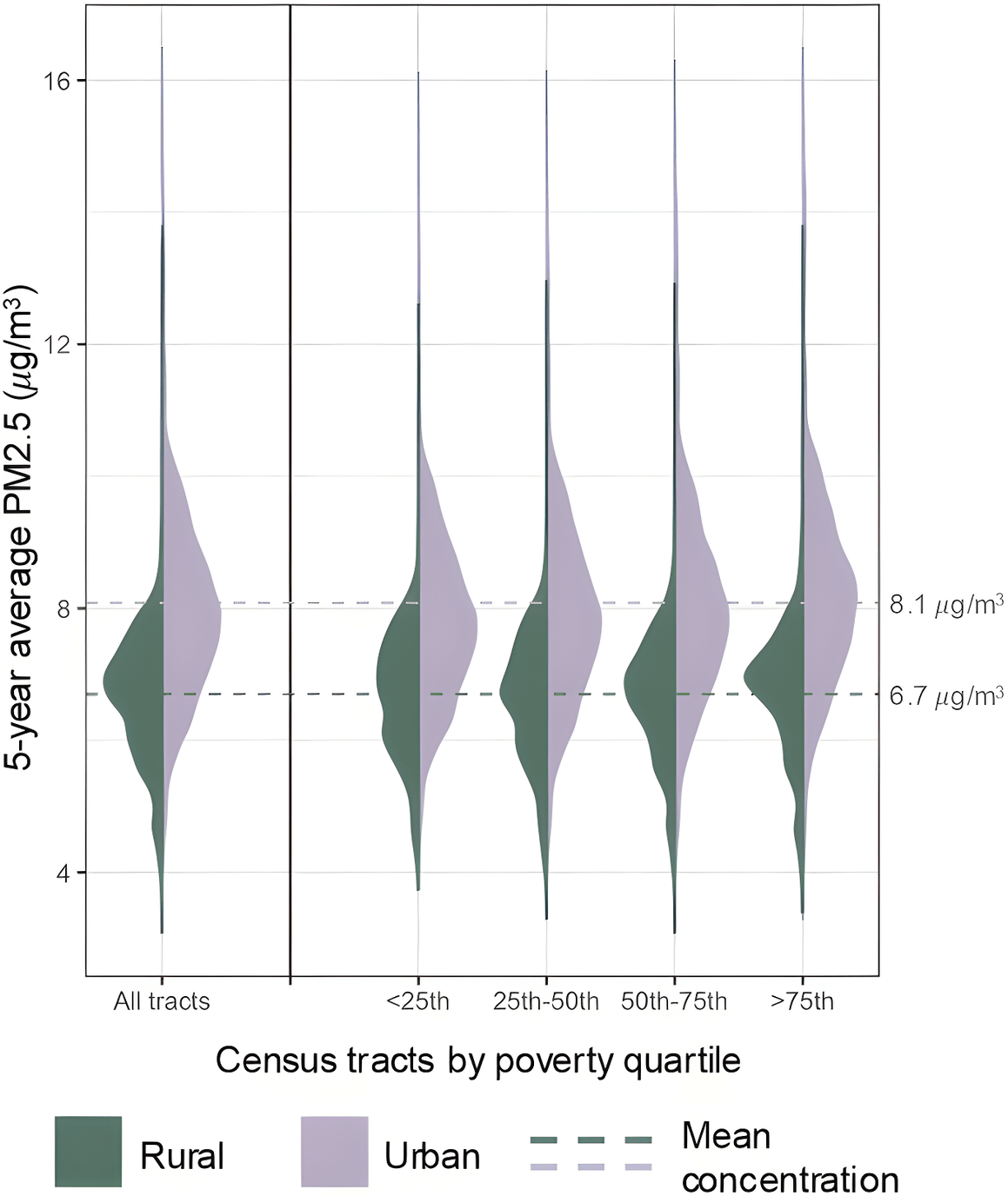
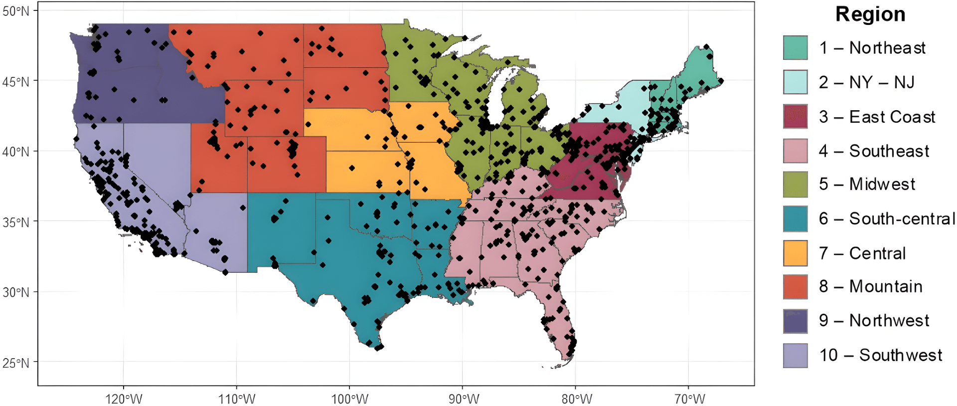
The paper's most consistent result is about poverty, not race. In rural census tracts, the higher the poverty rate, the farther the nearest air quality monitor. A 10% increase in poverty is associated, on average, with a 6% increase in distance to the nearest monitor. That pattern holds across all ten EPA regions without exception.
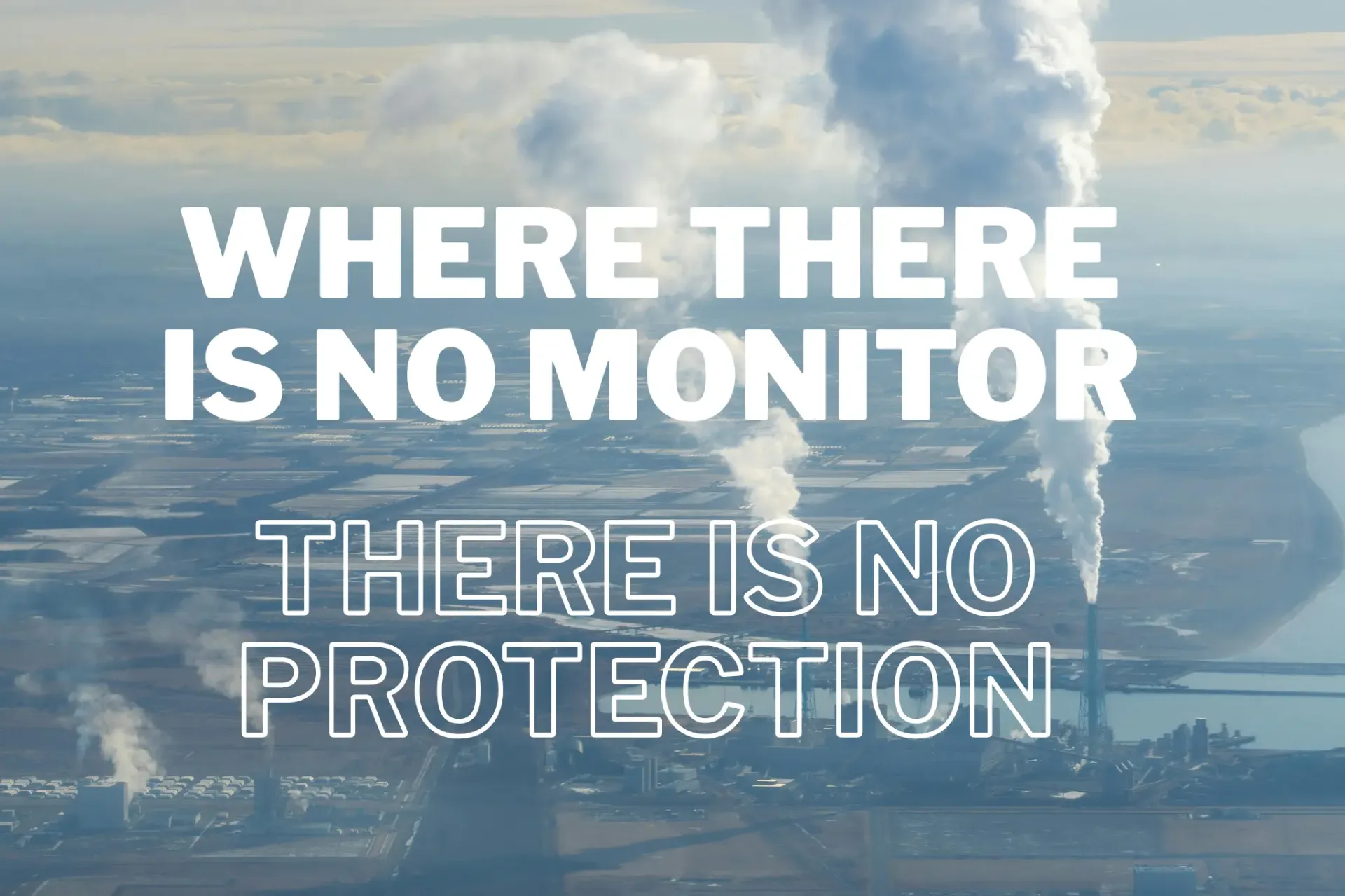
This matters more than it might appear. Monitoring isn't just a data collection exercise. Counties with monitors that record high pollution levels are subject to regulatory restrictions — and historically have seen measurable reductions in PM2.5 as a result. Where there are no monitors, there is no trigger. No enforcement. No reduction.
Access to monitoring is, in this sense, access to protection.
What the data doesn't show — and why that's the point
Across the US as a whole, the researchers find no strong systematic association between race and monitor proximity. This is the paper's most careful finding, and also its most important caveat: the monitor network is sparse enough that a single county-level monitor can fall near or far from communities of color almost by chance. The inequity may be local and invisible at the national scale.
One comparison makes this concrete. Two similarly sized cities — Lexington, Kentucky and Greensboro, North Carolina — each operate exactly one PM2.5 monitor. In Lexington, it sits near predominantly Black census tracts. In Greensboro, the opposite is true. Same federal framework. Same number of monitors. Completely different distributional outcome.
Averaging across thousands of such cases produces a national picture that looks roughly equitable. The lived reality underneath may be anything but.
The gap the models inherit
This would matter less if air pollution estimates could fill in where monitors are absent. But the models used to estimate PM2.5 exposure across the country — used in health research, policy design, and regulatory decisions — are built on the same monitoring data. Rural areas have the fewest monitors and the widest disagreement between models. The uncertainty concentrates precisely where monitoring is thinnest.
Rural communities with high poverty, high pollution, and no nearby monitor are not just underprotected. They are, effectively, unmeasured.
The question the paper leaves open
The researchers are careful not to claim that monitor placement is deliberately discriminatory. The data cannot show that. What it can show is the outcome: systematic gaps in coverage that align with poverty, particularly in rural areas, that persist regardless of pollution levels.
Whether that is the result of policy design, resource constraints, or something else is a separate question. But the effect is the same.
The map has a blind spot. And it falls in predictable places.
Source: Haskell-Craig et al. Environ. Sci. Technol. 2025, 59, 30, 15843–15852. CC BY 4.0
Read the full research