
Los Angeles is not one city when it comes to heat. Depending on where you live, a summer afternoon can mean 35°C or 45°C. The gap between those two numbers is not random — and a new study by Anamika Shreevastava and colleagues, published in Nature Communications in May 2025, is the first to measure exactly what drives it.
The question everyone assumed was already answered
For decades, research has pointed to redlining — the federal government's 1930s practice of color-coding neighborhoods by race to determine mortgage eligibility — as the root cause of urban heat inequality. Redlined neighborhoods were denied investment. Trees weren't planted. Concrete replaced green space. Those neighborhoods are hotter today.
That story is true. But this study asks whether it's complete.
Using thermal data from the ECOSTRESS instrument aboard the International Space Station — which captures land surface temperatures at 70-meter resolution, at different times of day, across seasons — Shreevastava and her team found something more complicated. Historic redlining and present-day income inequality are both real drivers of heat burden. But when they tested which one matters more today, the answer was current income, not historical grade.
What the data shows
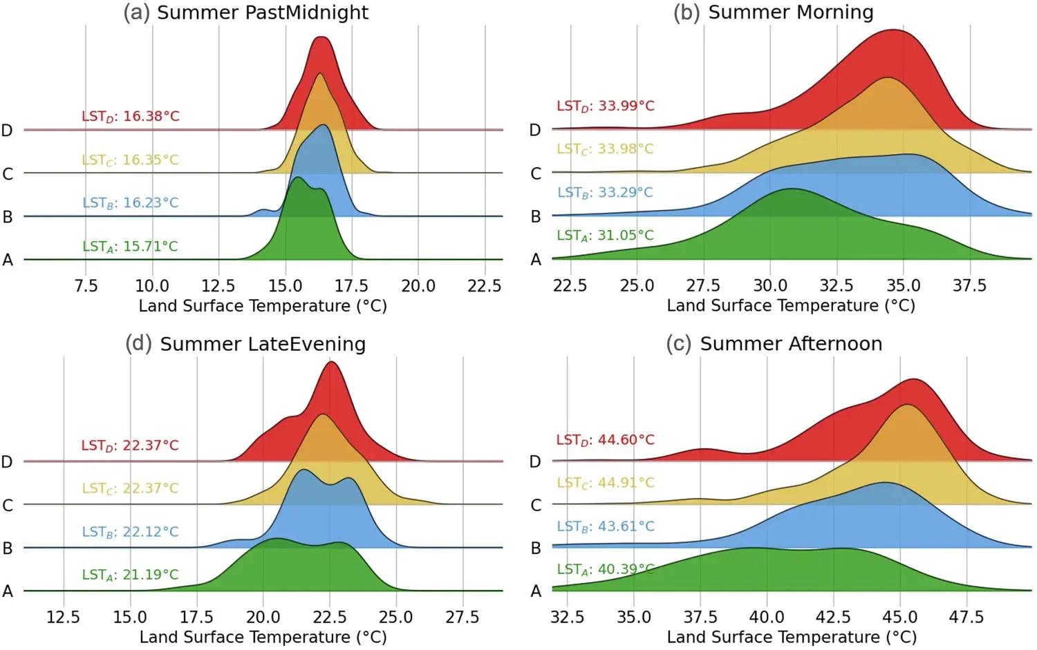
In the summer, C- and D-graded neighborhoods — those historically labeled "Declining" or "Hazardous" — are on average 3°C warmer than their A-graded counterparts during morning hours. By afternoon, that gap reaches 4–5°C.
But within each redlining grade, income creates an additional layer of separation. The difference between a low-income D-graded neighborhood and a high-income A-graded neighborhood reaches 5–7°C on summer afternoons. That is the combined weight of a century of discriminatory policy and present-day economic exclusion, measured in degrees.
Source: Shreevastava et al. (2025), Nature Communications, 16:4950. CC BY 4.0.
"For low-income neighborhoods, it doesn't matter what grade they were given a century ago. They're hot regardless."
The heatwave problem
The disparity doesn't stay constant. It grows.
For every 6°C rise in the city's mean temperature — the kind of increase that happens during a heatwave — the gap between low-income D-graded and high-income A-graded neighborhoods widens by nearly 1°C more. The researchers found this relationship held across 332 individual satellite scenes with an R² of 0.83.
In other words: heatwaves hit hardest in the neighborhoods least equipped to handle them. And as heatwaves become more frequent and severe, that amplification effect becomes more consequential.
Why affluence became insulation
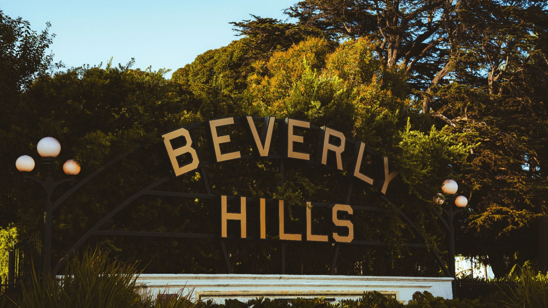
Some historically redlined neighborhoods are now wealthy — Beverly Hills sits partly in what was once D-graded territory. These neighborhoods are cool today. Not because the redlining legacy was remedied, but because affluent residents sought out naturally cooler, greener areas near the coast, and property values rose accordingly.
This process — what the researchers call "environmental gentrification" — reveals a structural irony. The same market forces that drive inequality in other domains also distribute heat. Low-income neighborhoods, regardless of their historical grade, are more likely to be selected as sites for industrial development, warehouses, and logistics facilities — all of which generate heat and displace green space.
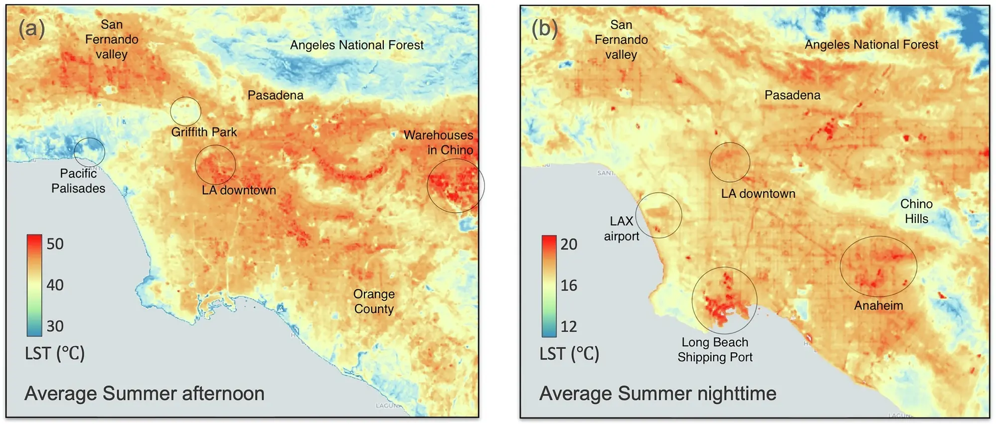
Source: Shreevastava et al. (2025), Nature Communications, 16:4950. CC BY 4.0.
Who lives in the heat
The study's vulnerability analysis makes the demographic picture explicit. African American residents are concentrated in south-central LA neighborhoods with high heat vulnerability scores. Hispanic residents dominate the San Fernando Valley and East LA — both among the hotter, more thermally burdened parts of the city. These communities also face higher pollution burden and lower rates of air conditioning access.
The overlap is not coincidental. It is structural.
What this means for policy
India's air quality standards set a threshold and call it acceptable. California's redlining maps drew lines and called them objective. Los Angeles's aggregate temperature statistics describe a city and call it a city.
In each case, what's missing is the distribution: who is inside the average, and who is outside it.
This study doesn't say the heat gap is permanent. It says the gap is currently driven more by economic conditions than by century-old maps — which means targeted investment in green infrastructure, heat-resilient housing, and cooling access could meaningfully close it. But that investment has to be place-specific and income-aware. A city-wide policy won't reach the neighborhoods that need it most.
Source: Shreevastava A, Hulley G, Prasanth S, et al. Contemporary income inequality outweighs historic redlining in shaping intra-urban heat disparities in Los Angeles. Nature Communications. 2025;16:4950. DOI: 10.1038/s41467-025-59912-x. CC BY 4.0.
Read the full article